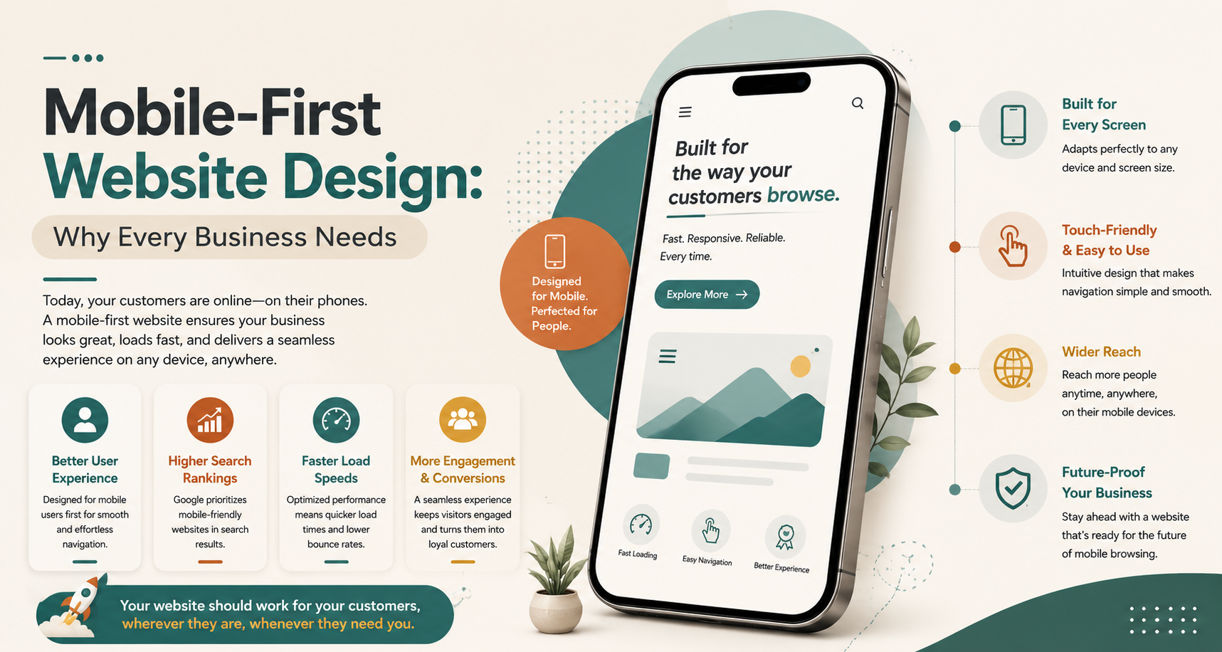
In today’s world, most people prefer to browse through their mobiles while looking for electronics, apparel, accessories, or services. It means that it should be user-friendly in the mobile version. Mobile-first website design involves designing a site mainly for mobile phones and adapting them for tablets and computers after that.
It is a great option for any business from the point of view of easy navigation, understanding content, and interactivity of the website. The type of your business does not really matter, as it might be a clinic, restaurant, online store, or another business. In any case, it should be user-friendly.
Let us suppose that you have your restaurant business, and there is some person who is looking for a restaurant nearby you in the same location as yours through the mobile phone. It is important for the person to know about the menu, its location, contact details, and timing of booking. If the website is not user friendly, then the person will simply move away from the website.
That is how mobile-first website design will be useful to you.
Why Mobile First Design Gets More Customer Attention
Think of the last time you tried to find a local business. It’s 100% that you used your mobile phone for searching. That’s what your visitors are going to be using.
It may be through organic search results from Google, through ads on social media, or through recommendations. In case your website is slow and not user friendly, your client will drop out.
Better User Experience
A good mobile layout can help visitors get important information without scrolling much or having a difficult menu. Also, it makes buttons and calls to action easy to use.
Faster Customer Decisions
It will be very easy for your clients to get an idea about the type of service that you provide when it is well-organized. This way, it will be easier for them to contact you and buy your products.
Stronger Mobile Engagement
A smooth experience encourages users to explore more pages and interact with your business.
Mobile-Friendly vs Mobile-First Design
Both approaches aim to improve mobile usability. However, their development strategies are different.
| Traditional Mobile-Friendly |
Mobile-First |
| Starts with desktop design |
Starts with mobile design |
| Mobile adjustments come later |
Mobile experience is the foundation |
| Navigation may become crowded |
Navigation stays simple |
| Content is adapted afterward |
Content is prioritized initially |
| Mobile issues may need fixes |
Mobile usability stays central |
Turn Mobile Visitors into Real Customers
Turn Mobile Visitors into Real Customers
How Can a Website be Appealing for Your Target Customers?
Small design variations can make a big difference to the visitor.
| Website Element |
What Customers Expect |
| Loading speed |
Pages should open quickly |
| Navigation |
Simple menus with fewer steps |
| Text |
Easy to read without zooming |
| Buttons |
Large enough to tap comfortably |
| Images |
Clear but optimized for speed |
| Contact options |
Easy access to call or enquire |
| Layout |
Clean and uncluttered |
Signs Your Website Needs a Mobile-First Upgrade
Your website may still function, but that does not mean it provides the experience customers expect.
Watch for these signs:
- Pages load slowly on smartphones.
- Text is difficult to read.
- Buttons are too small.
- Navigation feels complicated.
- Contact information is difficult to find.
- Mobile enquiries are declining.
- The design looks outdated.
Build Better Digital Experiences with Hydear
However, an effective website requires more than just appealing colors and graphics. It should know how humans search, explore, compare, and choose.
Hydear designs digital interactions that bring together innovative design with usability and performance. The web design strategy of Hydear places actual human behavior at the core of the website experience.
Irrespective of whether you need a new website or an existing one to be optimized, Hydear can help build a responsive digital platform that is designed for modern customers.
Whether you need a new website or want to optimize the existing one, Hydear can help you build a responsive digital platform for today’s customers.
What Hydear Focuses On
- Mobile-first designs: Content and navigation are designed primarily considering mobile phone users.
- Responsive Designs: Pages on the web adapt seamlessly to any screen size.
- Easy Navigation: Relevant information can be easily found without too much clicking.
- User-centric designs: Web page layout is created keeping customer behavior in mind.
- SEO-ready structures: Both technical and content features help in boosting SEO performance.
Hydear offers an efficient solution to companies seeking effective web design services.
Conclusion
The mobile-first web design allows the website to become customer-friendly, helps achieve responsiveness in design, enhances the performance in mobile devices, and makes the journey of the customer through the website effective.
While searching for the website designing company in Noida, the best website designing company in Delhi, or the best website designer near me, remember that design alone is not everything.